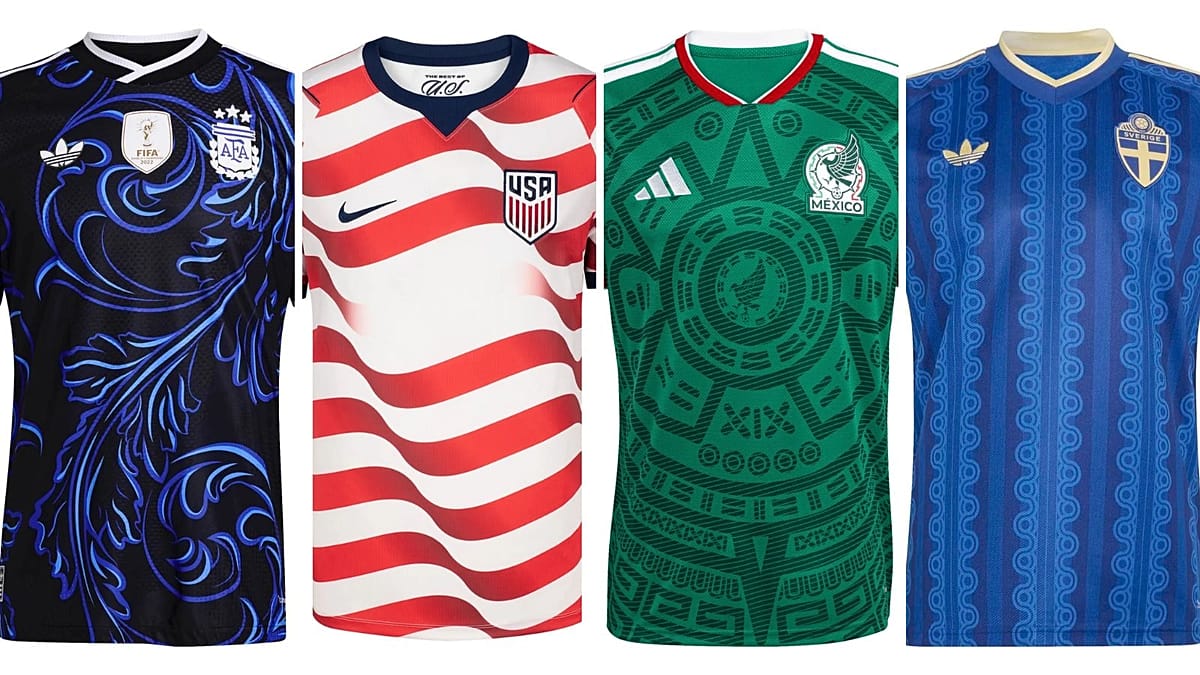
The 2026 World Cup is nearly upon us, and while the tournament itself is mired in controversy—exorbitant ticket prices, FIFA's political entanglements, and travel advisories—there is still room for a lighter debate: which teams will look best on the pitch? European Pulse has sifted through the kits of all 48 competing nations to identify the stylish winners and the unstylish losers.
The Best of the Bunch
Argentina – Away kit
Adidas has delivered a standout design for the reigning champions. The black shirt features blue foliage inspired by Fileteado, a traditional Buenos Aires art form characterized by stylized lines and symmetry. It honors the culture of Porteños while looking fierce. This is how you play in style.
France – Home kit
Nike's offering for Les Bleus is less flashy than their Euro 2024 shirt but significantly more stylish. The trademark blue is accented with a cool zig-zag pattern, a tidy white collar, and bronze textured logos. Effortlessly suave, as one expects from the French.
Ghana – Home kit
Puma's design draws on the West African folklore figure Anansi, a spider associated with wisdom and cunning. The central Black Star and cracks spreading from it evoke a spider's web. It is both vibrant and cleverly designed, doing justice to tradition and fashion.
Mexico – Home kit
Co-host Mexico gets it right with a green shirt adorned with the Aztec Piedra del Sol calendar. The subtle use of the country's flag colors works wonders. Top marks for a design that is both elaborate and stunning.
Nigeria – Away kit
Nike's design for the Super Eagles checks all the boxes: flag colors, a simple but striking pattern, and a stylish collar. It is a worthy addition to Nigeria's tradition of memorable kits.
The Unstylish Losers
USA – Home kit
Nike's home shirt for the co-host nation is an improvement on 2022's plain white, but the fluttering red-and-white stripes feel too on-the-nose, especially with the USA's 250-year anniversary celebrations. The whole thing screams "250 Freedom" and "Look Ma, I'm star-spangled awesome." It works in tandem with the away kit, but it is too heavy-handed for our taste.
Sweden – Away kit
Adidas's away shirt for Sweden is more interesting than the traditional yellow home kit, but the ripple pattern gives us a headache. It reminds us of octopus tentacles—anyone hungry for pulpo right now?
Brazil – Away kit
Designed in collaboration with the Jordan brand, this black and navy shirt has a great crest position and yellow borders. However, the graphics look like sweat stains. The inspiration from the Amazon's poison dart frog is a niche reference, but in practice, it doesn't work.
England – Home kit
Nike's design is an obvious 90s Umbro callback. It is not an eyesore, but it is one of the most boring kits. The "Happy and glorious" inscription inside the shirt is a misstep—England hasn't been happy or glorious since 1966. Get over it.
For those seeking a respite from the tournament's controversies, these kits offer a welcome distraction. Whether you are a football fan or a fashion enthusiast, there is something to admire—and something to mock.