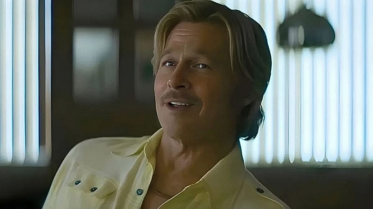
Brad Pitt is stepping back into the boots of Cliff Booth, the stuntman who won him an Academy Award in Quentin Tarantino's 2019 Once Upon a Time... in Hollywood. The first trailer for the follow-up has now landed, and the conversation around it has little to do with the plot. Viewers across social media are complaining, almost unanimously, that they can barely make out what is happening on screen.
The sequel, directed by David Fincher rather than Tarantino, picks up eight years after the original. Booth has left stunt work behind and now operates as a "studio fixer" — a role that suggests a shift from the sunlit, laid-back Los Angeles of the first film towards something considerably more shadowy. Tarantino wrote the script but handed directing duties to Fincher, reportedly because he did not want this to count as his tenth and final feature under a self-imposed rule.
A palette problem, or a deliberate choice?
The trailer's visual style has become the story. One widely shared post on X asked why the film was "so fucking dark", arguing that the material is supposed to be fun rather than reminiscent of Fincher's Zodiac or Mindhunter. Another user complained that a "dark tinted camera effect" had been applied and questioned why the technique keeps recurring.
One more measured comment framed the shift as a tonal decision: where Tarantino shot on warm 35mm film to evoke a dreamy, golden California, Fincher's sequel leans on his signature heavy shadows and clinical yellow-green tones. On that reading, the lighting strips away the mythic, easygoing hero to expose a darker character beneath.
"The heartbreaking story of a woman who can no longer afford lamps in her office."
This is not an isolated grievance. Earlier this year, the trailer for The Devil Wears Prada 2 was mocked for its dim look, with one viral post describing it as the tale of a woman who can no longer afford lamps in her office. Audiences have grown increasingly vocal about what they see as a broader darkening of cinema.
Who is to blame for the gloom?
Several explanations circulate. Some point to filmmakers trying to make digital photography feel more cinematic, or to a mistaken belief that a darker image automatically reads as serious. Others blame the standardisation of "content" by major streaming platforms. Netflix has faced repeated accusations of imposing a so-called "Netflix Look" — uniform lighting, muted colours and flattened contrast that make disparate films feel interchangeable.
For European audiences, the debate has a practical dimension. The sequel is destined for Netflix, meaning viewers in Paris, Berlin, Madrid and Warsaw will watch it at home rather than in a cinema. Those with older televisions or bright living rooms may find themselves adjusting picture settings before the opening credits finish. Fincher's reputation for meticulous, low-light compositions — honed across Se7en, Gone Girl and The Social Network — will be tested on screens that were never calibrated for it.
Pitt, meanwhile, remains a fixture on the European festival circuit. He returned to San Sebastián last year after a 17-year absence, and his willingness to revisit Booth suggests the character still holds appeal for him. Whether audiences will embrace a version of Cliff Booth rendered in Fincher's gloom is another matter.
The film arrives later this year. Until then, the argument over lighting is likely to run — and it says something about how viewers now experience cinema, whether in a darkened theatre or on a sofa with the curtains open.